


Websites that adapt on the fly
“Responsive web design” meets customers wherever they want to be
- |
- Written by Marina Stein, Corporate Insight

The days of online banking being limited to desktop computers are over.
Modern consumers are increasingly interacting with their banks using mobile devices such as tablets and smartphones. Understanding the popularity and value of on-the-go banking services, a handful of financial companies are beginning to introduce websites with “responsive design” to optimize their digital resources across the online and mobile channels
Fitting your website to user’s venue
A website featuring responsive web design (RWD) will detect what device is being used and fluidly adapt to a layout optimized for that screen size. RWD promises to minimize the burden of designing and updating websites for multiple screen sizes by rearranging and re-sizing content modules by pre-set order.
Among the banks covered by Corporate Insight’s Bank Monitor research service, Capital One, Capital One 360, and Santander Bank are the first to implement responsive design.

Each of these firms employ RWD on their public sites. The sites’ responsive design elements can be seen when adjusting the size of a browser window on a desktop computer. As the browser is minimized, the website adapts, automatically fitting proportionally to the size of the screen, so that users can still view and conveniently access the most important content.
A responsive site will condense main navigation menus into a flyout menu, allowing users to easily navigate the site. Additionally, page content is typically stacked, allowing users to easily view all information.
This same technique is applied when users access these websites from their mobile phone or tablet, as responsive design detects the device a user is viewing. The use of RWD allows site visitors to view the firm’s website without being redirected to a mobile device-specific site, creating a consistent customer experience across their desktop and mobile platforms.
Interestingly, Capital One 360 and Santander Bank do not apply this design element to their private site online account management sites. Capital One features RWD on its private site card management site, but not on the banking side.


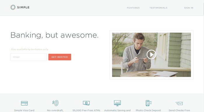
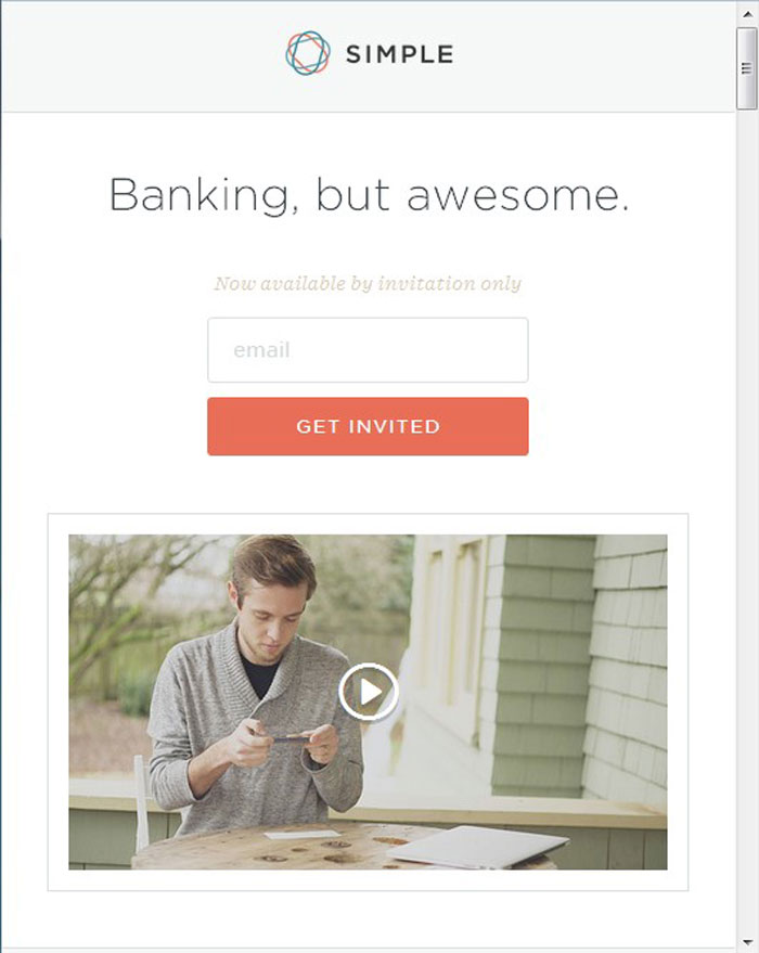
Visa Simple, a non-traditional, online-only bank, also utilizes responsive design on its website. Simple’s model is banking on-the-go and its main service is its mobile banking feature. Therefore, it is not surprising that the company’s website was designed with the mobile experience in mind.
Other banks also dabble in RWD but do not have fully responsive websites. Although the PNC Bank public site is not responsive, the PNC Virtual Wallet sitelet features RWD.
The American Express website responds to changes in the size of a desktop browser, however, it eventually redirects users to the AmEx mobile site when the browser window becomes a certain size.
 Full browser window—American Express website
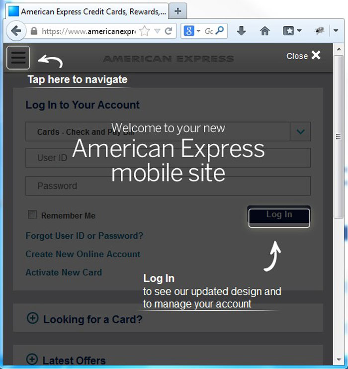 Browser window made smaller—American Express mobile website
Don’t be the last aboard RWD
The move to RWD is a growing trend in the banking industry. RWD can certainly be a cost-effective alternative to mobile and tablet apps.
With so many banks already offering apps, those that haven’t already implemented RWD may not see the benefit in redesigning their websites to add this feature.
However, responsive design gives consumers the full banking experience, while a mobile app only focuses on a specific set of activities; a fraction of the functions available on a full site.
While mobile apps help consumers easily tackle everyday transactions, they would benefit more from the full site experience. This is especially useful for prospective clients, as they are less likely to download an app when researching a bank with which they are considering opening an account.
About the author
Marina Stein is senior analyst, banking and credit cards, at Corporate Insight, where she heads up Bank Monitor and Credit Card Monitor research services. Stein has spent her entire career at Corporate Insight researching the online banking and credit card space. Her past reports have examined online account statements, account opening best practices, fees, and other topics essential to banks and credit card issuers.
Tagged under Retail Banking, Channels, Mobile,